Elements and design choices to consider when designing a chapter opening page.
The first page of each chapter is one of my favorite things to design. This is one place where the tone of your book and its subject matter can be visually communicated. The design of these pages can range from very simple to more elaborate design choices that spread across two pages.
The Chicago Manual of Style says that each chapter normally starts on a new page, and can sit on a verso (left) or recto (right) page, although the first chapter almost always starts on a recto.
Some elements that you can expect to see on a chapter opening page are:
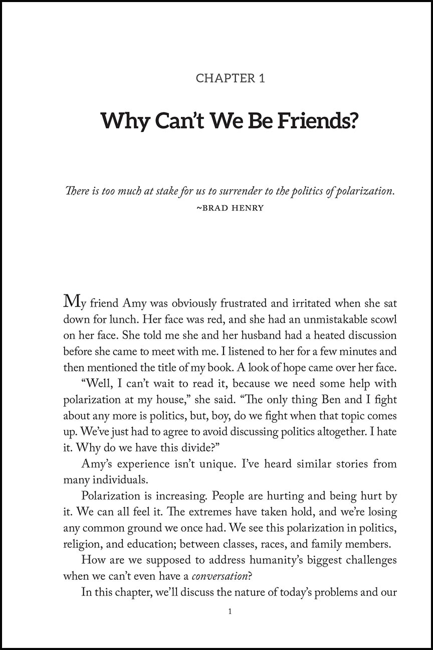
Chapter Number (the word chapter is often omitted)
Chapter Title
Subtitle (if there is one)
Epigraph (if there is one)
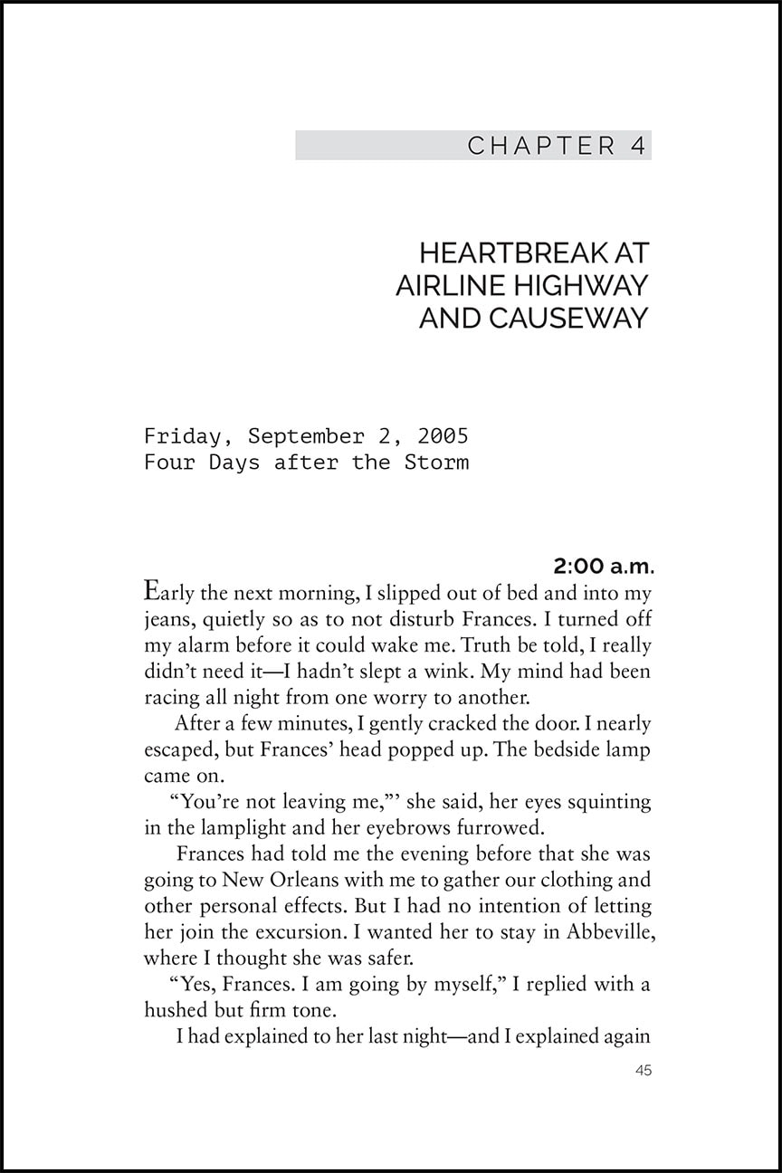
Drop folios (or no folio)
No running heads
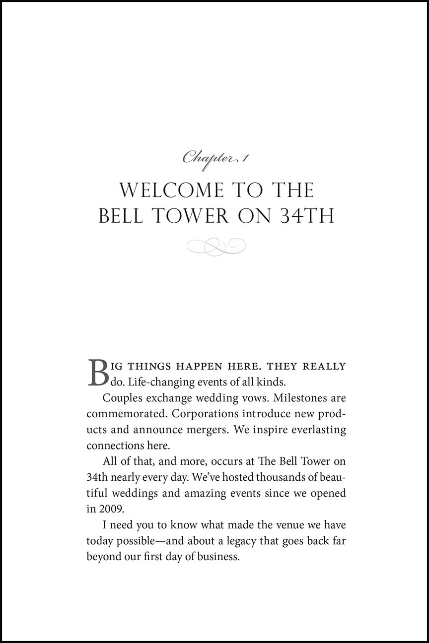
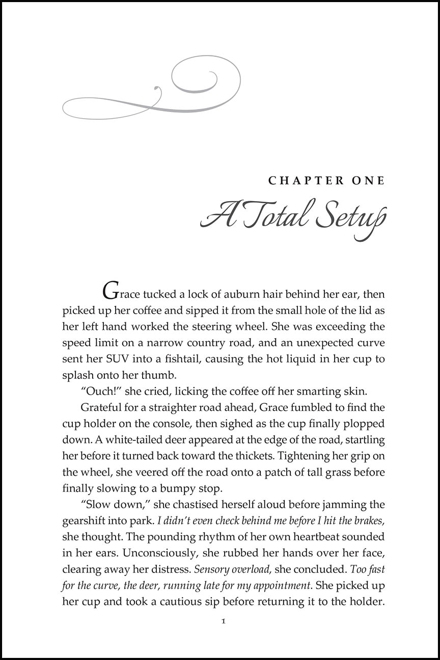
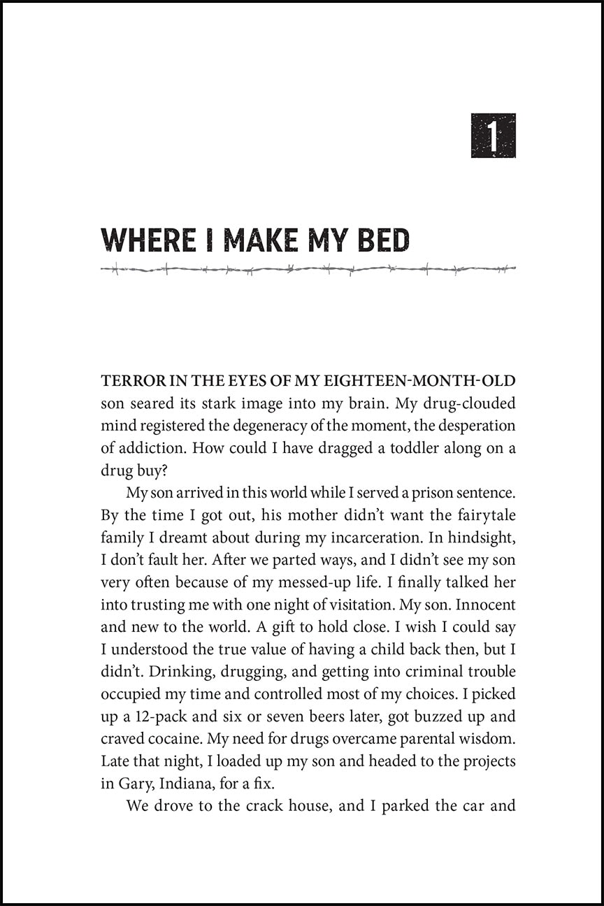
The design of this page can vary greatly and should reflect your book's subject matter and tone. The right choice for you may be incredibly simple and understated with only the chapter title or number, or it could be more lively and contain graphics and other relevant display items.
Some possible elements for the chapter opening page design include:
Ornamentation or graphics
Illustration
A font complimentary to the body text and expressive of the feeling of the content
A font that echoes the font choice on the cover
A drop cap in the first paragraph of text
Italics or small caps on the first line of the first paragraph
Whichever design style that you choose for your chapter opening page, it is important that it does not distract the reader from their reading flow. Beautifully designed chapter opening pages can be enjoyable to the reader and a refreshing pause before diving into the next section of text.
Below are a few examples of chapter opening pages that I've recently designed.
When I work with you to design and format your book interior we will spend some time together before the project begins so that I can learn about your book and any style preferences or ideas that you have. Using this information I then go to work making that vision come to life. Depending on the project I will present a couple different options for the interior design that you can choose from so that you can see the possibilities and refine it to reflect what is best for your book.
Please email to set up a consultation to design your self published book!
Want more tips like this? Subscribe to my monthly book design newsletter.
Help for Independent Presses
Book Design & Production
Have you written a nonfiction or fiction manuscript? After it has been professionally edited, I can design the interior pages and cover, plus guide you through the maze of book publishing and printing. To get started, contact me to discuss your project and my helpful guide for authors.

