fbpx
Open post
Adapt Your Print Book for the Digital World: Smart Tips eBook Formatting

Adapt Your Print Book for the Digital World: Smart Tips for eBook Formatting

A couple of weeks ago, I found myself exploring the banks of the Clark Fork River captivated by the scene unfolding at the water’s edge. The vibrant plant life was thriving in that transitional moment between fall and winter, adapting effortlessly with grand flair to these ever evolving seasonal shifts—much like stories, which can take on new forms while still preserving their beauty and essence.

Adaptability is one of the most remarkable qualities of a story—it can shape itself to fit any medium, from a beautifully printed hardcover to the screen of an e-reader. But embracing this adaptability often means rethinking how your book works in its new digital form.

When formatting an ebook, it’s essential to prioritize user experience. While it might feel tempting to replicate your print book exactly, digital reading comes with unique challenges. Wide elements like tables and charts, for example, often don’t translate well to smaller screens. Instead, consider reworking them into simpler, reflowable formats that are easy to read and interact with. This isn’t a compromise—it’s an opportunity to enhance how readers engage with your content.

Fall aquatic plants in Montana

6 ways to Elevate Your eBook Design

  1. Start with Essentials Up Front
    Your ebook should immediately inform readers where they are with a clear title page and concise copyright details. This ensures a polished, professional impression from the first screen.
  2. Use a Clickable Table of Contents
    An interactive ToC is a hallmark of a well-designed ebook. Readers can jump directly to chapters or sections with a tap, making their reading journey seamless and enjoyable.
  3. Rework Wide Content
    Tables, charts, and other wide elements don’t always work well on digital screens. Simplify them or break them into smaller, readable chunks. Reflowable text or images are easier for readers to navigate and keep their focus on your content, not struggling with layout issues.
  4. Incorporate Interactive Features
    Ebooks offer tools print can’t match. Add features like hyperlinks to external resources, embedded multimedia (such as audio or video), or pop-up definitions for complex terms. These elements can make your ebook more dynamic and valuable.
  5. Refine Chapter Layouts and Enhance Readability
    Begin each chapter on a new page and maintain consistent formatting for headings and subheadings. Use adequate spacing and section breaks to keep the narrative flowing. These small adjustments create a smoother and more enjoyable reading experience for your audience.
  6. Leverage the Back Matter
    The back matter is an incredible space for adding value and engaging readers:
    • Acknowledgments: Thank collaborators, editors, family, or supporters. This adds a personal touch.
    • About the Author: Share your story and include links to your website, social media, or newsletter sign-up.
    • Call-to-Action: Invite readers to leave a review, check out related books, or explore additional content.
    • Sneak Peeks and Previews: Offer a teaser for your next book to entice readers to keep following your work.
    • Interactive Links: Use links to drive traffic to resources, blogs, or even exclusive downloads.

Want More Tips for Your Self-Publishing Journey?

My newsletter is packed with helpful advice on book formatting, design, and digital publishing. It’s your personal resource for making your book stand out!

What’s Next?

With these steps, your ebook will not only look professional and inviting but also provide an engaging, intuitive experience for your readers. Thoughtful formatting goes beyond aesthetics—it’s a chance to enhance reader connection and open up new opportunities to share and market your work. Ready to take your ebook to the next level? Let’s talk about how I can help with adapting your print book for the digital world.

Help for Independent Presses

Book Design & Production

Have you written a nonfiction or fiction manuscript? After it has been professionally edited, I can design the interior pages and cover, plus guide you through the maze of book publishing and printing. To get started, contact me to discuss your project and my helpful guide for authors.

Open post
Proofreading Tips for Self-Publishing Authors

Proofreading Tips for Self-Publishing Authors: How to Perfect Your Manuscript Before Publishing

I recently enjoyed some fall days on a trip to Yellowstone National Park for a workshop called Decoding the Language of Nature. Taught by expert naturalists and animal trackers Jon Young and George Bumann, it was an incredible experience—learning about, watching, and listening to wolves, coyotes, bison, pronghorn, birds, and other wild creatures all participating in a continuous flow of intricate communication. Spending time honing my eyes and ears to begin listening in reminded me of how small details shape the bigger picture—something that’s just as true for books as it is for the natural world.

After returning from this remarkable experience, I’ve been diving back into book design and working with self-publishing authors to help them bring their manuscripts to life. A recent conversation with one of my clients about the importance of proofreading sparked the idea for this blog post. I thought it might be helpful to share some essential tips for authors looking to refine their own work before publishing.

While hiring a professional proofreader is always the ideal choice for a polished final product, some authors prefer to tackle the proofreading process themselves. If that’s you, here are a few crucial tips to help catch those pesky errors and ensure your manuscript is ready for readers.

Yellowstone Bison walking through the early morning mist.

5 Proofreading Tips for Self-Publishing Authors

Practical Steps to Help You Polish Your Own Manuscript

  1. Take a Break
    Setting your manuscript aside for a day or two before you begin proofreading is one of the most effective ways to gain fresh outlook. Coming back to your work with rested eyes allows you to spot issues you might otherwise miss. This step can make all the difference when it comes to catching errors in your own writing.

  2. Print it Out
    Reading on paper offers a new perspective. Errors, inconsistencies, and awkward formatting are often easier to catch when you’re looking at a physical page instead of a screen. Printing out your manuscript also allows you to make notes and corrections directly on the paper, which can streamline your editing process.

  3. Use a Checklist
    Proofreading without a plan can make it easy to overlook small but significant details. Create a checklist that covers common issues, such as spelling, grammar, and punctuation, as well as elements specific to your manuscript, like character name consistency or formatting. This ensures a thorough review and helps produce a more professional final product.

  4. Read Backwards
    One helpful trick for catching typos and other small errors is to read your manuscript backwards. By isolating each word, you force yourself to slow down and focus on individual elements, which makes it easier to spot mistakes. This technique helps you catch spelling errors and misplaced words that might be missed when reading normally.

  5. Eliminate Distractions
    Proofreading requires your full attention, so be sure to find a quiet space where you can focus. Minimizing distractions—whether it’s turning off notifications, setting aside dedicated time, or finding a quiet environment—will help you catch subtle errors and polish your manuscript effectively.

Want more? See Below...

Download all 10 Tips

These 5 tips will help you begin to refine your manuscript.
But there’s more to consider if you’re committed to a truly polished final draft!
To access all 10 of my proofreading tips to help you through the process, you can download the full resource here by signing up for my newsletter.

What’s Next?

Once you’ve perfected your manuscript, you’ll still have other steps to consider on your self-publishing journey, from cover and interior design to help navigating print-on-demand options and beyond. If you’d like help with any aspect of your book’s design or have questions about the self-publishing process, feel free to reach out. I work with self-publishing authors to bring their vision to life and help make the journey smoother.


Final Thoughts

Creating a professional-looking book takes attention to detail, but you don’t have to do it alone. By following these proofreading tips and signing up for my newsletter, you’ll gain access to even more resources to support you on your self-publishing journey. Together, we’ll make sure your book is ready to connect with readers around the world.

Help for Independent Presses

Book Design & Production

Have you written a nonfiction or fiction manuscript? After it has been professionally edited, I can design the interior pages and cover, plus guide you through the maze of book publishing and printing. To get started, contact me to discuss your project and my helpful guide for authors.

Open post

Capture Your Reader’s Attention with Stunning Cover Design

Why Invest in Professional Cover Design?

A compelling cover does more than catch the eye; it speaks to the heart of your prospective readers, inviting them into the world you've created. With a blend of artistry and strategy, a well-designed cover can make your book stand out while fitting seamlessly within your genre. It's about creating a visual narrative that resonates with your audience, encouraging them to explore further.

How I Can Assist You

With my expertise, we can navigate the intricacies of cover design together. From understanding your book’s essence and target audience to selecting imagery and typography that amplifies your story I'm here to bring your vision to life and be your guide through the process to ensure your cover is not just beautiful but effective.

Here are some ways that we will collaborate on your book cover:

It's Not Abut Us book, audiobook cover, and ebook designPersonalized Cover Design: Your book's genre, target audience, and core message guide my design strategy. I delve into the specifics, from genre norms to the subtleties that make your book unique, crafting a cover that not only captivates but also communicates.

Technical Expertise: Transitioning from manuscript to print or eBook format is seamless when you work with me. I handle the complexities of file creation and formatting, ensuring your book is ready for platforms like Amazon's KDP and IngramSpark, without the technical headaches.

collaboration between book designer and authorCollaborative Process: Your vision is paramount. Through regular updates and open communication, I ensure that the design aligns with your expectations, incorporating your feedback and providing revisions to perfect your cover and interior layout.

Showcasing Success

Every project is a story of collaboration and creativity, resulting in covers that not only captivate but also sell. For a glimpse into the transformative power of exceptional cover design, I invite you to explore my portfolio of recent projects and discover how I've worked together with authors to elevate their visions into captivating visual stories.

Ready to Transform Your Cover?

Embarking on your cover design journey is just an email away. Contact me to discuss how we can turn your vision into a visual masterpiece that attracts and delights your target readership.
I would love to be a part of your publishing adventure and look forward to creating something remarkable together!


Help for Independent Presses

Book Design & Production

Have you written a nonfiction or fiction manuscript? After it has been professionally edited, I can design the interior pages and cover, plus guide you through the maze of book publishing and printing. To get started, contact me to discuss your project and my helpful guide for authors.
Open post

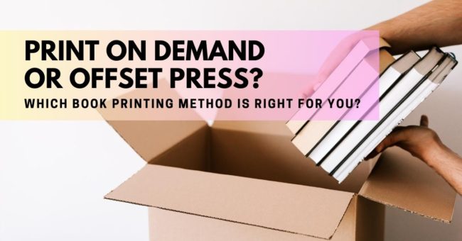
Discover the Pros and Cons of Digital and Offset Printing

Few things are as exciting as opening the box holding copies of your freshly printed, self published book! After all the months, maybe years, of crafting and developing your story and making careful and intentional choices in its production, it is so satisfying to finally hold the finished book in your hands. In this newsletter we will explore common options for printing and some important differences between them that will empower you to make choices that will help bring your book to life and save you potential disappointment from unexpected results.
Self-publishing authors are faced with many choices during the production process of their book. An important one is the choice between digital or offset printing. While both methods have their pros and cons, the decision ultimately depends on personal preferences and budget. Here's a quick breakdown of each:
Print on Demand (POD) platforms like Ingram Spark and KDP have made self-publishing more accessible than ever before. They offer user-friendly tools and affordable options, allowing authors to publish their work and reach a wide audience through extensive distribution channels. However, it's important to note that POD books can differ significantly in quality compared to books printed traditionally with an offset press. POD relies on digital printing, which is cost-effective for small print quantities but unfortunately lacks reliable consistency in the final product. POD companies also work with multiple printers to get the job done. Each book is printed individually as its own print run and the machine is not calibrated between runs making it impossible to guarantee consistency between printers and runs. Nevertheless, readers will likely never see the book they have purchased side-by-side with the same book that may have been printed elsewhere, so the differences may go unnoticed to them.
Offset printing is ideal for larger print runs and delivers high-quality results. It offers greater consistency and precision in color reproduction throughout the print run. Offset presses also provide options for a wider range of colors and higher quality paper choices. However, with this method there is a large upfront expense, you'll need storage for the printed books, the lead times are longer, and you will need to arrange your own distribution for the book.
In summary, print on demand allows for quick, flexible publishing and easy distribution at a low cost. It's suitable for printing a single copy or a small quantity, and you can even dropship a book anywhere that you like. It will be a fine looking book but, it may not meet your desired level of quality. Offset printing ensures a high-quality product but requires printing a large quantity, storage space, and a higher upfront investment. Additionally, you'll need to manage the distribution process yourself.


Help for Independent Presses

Book Design & Production

Have you written a nonfiction or fiction manuscript? After it has been professionally edited, I can design the interior pages and cover, plus guide you through the maze of book publishing and printing. To get started, contact me to discuss your project and my helpful guide for authors.

Open post
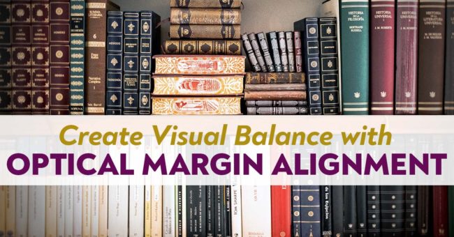
Learn how hanging punctuation enhances the reader experience!

Create Visual Balance with Optical Margin Alignment

When you want your page to have visually clean, crisp lines, using hanging punctuation can help! Hanging punctuation was first used in the Gutenberg bible where hyphens and other text features were slightly bumped into the right and left margins to create visual uniformity on the page. It was a very tedious job in those days and usually there was one person dedicated solely to that task. In modern times, advanced typesetting software makes this a simple job. It includes more than just hyphens and punctuation, and is called optical margin alignment.
So...what is it?
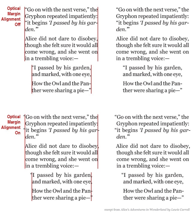
This optical margin is the "invisible line" that your eyes see when looking at the right and left edges of a block of text. Take a look at the text samples below:
optical-margin-alignment
When characters like quotation marks, periods, commas, hyphens and dashes, and others are not hung into the margins, it creates a visual indent, or negative space, in the block of text as a whole that can sometimes feel distracting to the reader. Using optical margin alignment helps create the appearance of a flush right and left edge by removing the negative space. This more visually balanced text allows the reader a neat, clean, uninterrupted reading experience.
It should also be noted that, while this technique is widely used - especially with justified text, it's not a rule set in stone that it should always be used. It can be used throughout your book, or just in certain places, like excerpts, quotes or lists that, by design, are separated from the main flow of text. Ultimately the decision to use optical margins is a matter of preference that, as a self-publishing author, you can decide if it seems right for your book. Some people prefer the look of their text without the optical margin alignment and that's okay. The overall goal is to create a great reading experience and sometimes we get there in in different ways.

Help for Independent Presses

Book Design & Production

Have you written a nonfiction or fiction manuscript? After it has been professionally edited, I can design the interior pages and cover, plus guide you through the maze of book publishing and printing. To get started, contact me to discuss your project and my helpful guide for authors.
Open post

What goes on your Title Page?

Did you know that your book can contain two title pages? The first appears as the very first page when you open the cover and is called a half title page. The only thing on this page is the title of your book, usually small and understated. A half title page is not a requirement, and is mostly a leftover tradition from back-in-the-day when it is said to have been used as protective measure during the printing process.
Whether or not you choose to include a half title page is up to you and the needs of your books, but you wouldn't want to leave out the second type, the title page. The title page is an important page that acts as a welcoming committee to those who've opened the book. It is the official start of your book and its design and content is quite simple, containing the:
  • full title of the book
  • subtitle if there is one
  • author name(s)
  • publisher name and location
Depending on the genre of your book other information may also appear here, such as an editor name or edition numbers.
Just because a title page is simple doesn't mean it has to be boring (says the designer!) A common design technique is to echo the cover by adapting artwork and/or font styles used there to appear on this page. If complex artwork is used on the cover, you may have to simplify it so that it doesn't overwhelm the page and that it prints well in black and white (if that's how your book's interior will be printed.)
Here are a couple examples of title pages that I've recently designed.

The title page for The Change Code uses the same font from the cover and a nautilus shell used as a decorative element both on the cover and throughout the interior as a section divider.

Seizing Moments of Possibility closely echoes the cover design. It also lists the publishing company name and location under the author name.

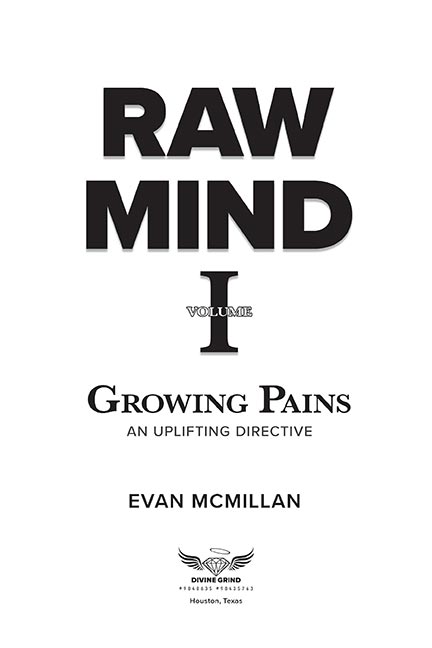
Raw Mind also closely echoes the cover design and shows the publishing company name, logo, and location.

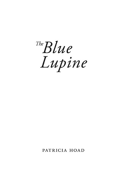
The Blue Lupine, a book of poetry, uses a very simple title page design. The font and arrangement of text echoes the cover.

Help for Independent Presses

Book Design & Production

Have you written a nonfiction or fiction manuscript? After it has been professionally edited, I can design the interior pages and cover, plus guide you through the maze of book publishing and printing. To get started, contact me to discuss your project and my helpful guide for authors.

Open post

What goes in the front matter of your book

Do you wonder what kind of content should go in your front matter? Front matter is all of the pages before your first chapter or part and contains information about your book, provides a way to navigate the book, and introduces it to your reader. These pages are numbered with lowercase roman numerals (i, ii, iii, iv, v, etc.) and, although they shouldn't be printed on the title page through the table of contents, they are included in your total page count. Page 1 usually starts at the first chapter or part.

Tips for organizing your front matter.

The Chicago Manual of Style indicates that the order of the front matter should be:

  • Book half title
  • Series title, other works, frontispiece, or blank
  • Title page
  • Copyright page
  • Dedication
  • Epigraph
  • Table of Contents
  • List of Illustrations
  • List of Tables
  • Foreword
  • Preface
  • Acknowledgments (if not part of preface or in the back matter)
  • Introduction (if not part of text)
  • Abbreviations (if not in the back matter)
  • Chronology (if not in the back matter)

Clearly, not all of these elements will be in every book, but this will give you guidance on how to organize the parts that you do have.

Pro-Tip: To help your book designer organize and set a design for your book, create a content map for them. This can be a simple Word document that lists each component of your book. Any special instructions that you have for each part can be included.

Help for Independent Presses

Book Design & Production

Have you written a nonfiction or fiction manuscript? After it has been professionally edited, I can design the interior pages and cover, plus guide you through the maze of book publishing and printing. To get started, contact me to discuss your project and my helpful guide for authors.
Open post
Tips on how to prepare your manuscript for the book designer.

Preparing Your Manuscript for the Book Designer

So you've finished writing your book and are ready for the layout and design stage. Before you send it off to your formatter there's a bit of "house cleaning" to do first to ensure that they can clearly see and understand the formatting needs of your book. Remember, the designer is not as familiar with your content as you are, so preparing a clean document to send to them saves time (and cost) and helps eliminate guess work or misunderstanding of how an item is intended to look on the page.
So! roll up your sleeves and get ready to clean up your working document.

Tips for preparing your manuscript
for the book designer.

  • Send the final and complete manuscript in Microsoft Word. Including all the front matter, the book block and any back matter. If your chapter has titles, include a table of contents, but don’t add the page numbers. This is one of the last things your designer will do after all of the text is set.
  • Organization and consistency is key. Manuscripts that are complex, especially non-fiction can become messy very quickly and, if not organized properly, can make it difficult for your designer to know how to proceed. So make sure that each element, such as chapter titles, section titles, each level of subheads and bullets, quotes, or other similar content is formatted the same throughout.
  • Make sure the information hierarchy is clear. For example, with part titles and numbers, chapters titles and numbers, sub-heads, and sub-sections it is important to make sure each of these elements is formatted the same way throughout the manuscript - and each are different from one another. The idea is to make it so the designer can easily spot the distinct parts and format them accurately.
    • For example: Format all part titles bold and 24 points, then make all chapter titles bold and 20 pt, so when the designer looks at your Word manuscript, they can easily see that those two items are not the same thing.
    • The same would be true for subheads. To indicate which is which, maybe format level one subhead as bold and 14 points, and then perhaps make level two subheads italic and 12 points.
  • If you’ve used unusual characters, foreign letters or words or other symbols, point these out to the designer.

Format the manuscript simply

  • Use only one font throughout the manuscript. Times New Roman is just fine. It can be used for everything - the chapter titles, subheads, everything. If a complimentary font is desired, this will be communicated before the project starts and the designer will apply it appropriately in their professional layout software.
  • Use of bold and italic is perfectly okay. The designer can easily see and retain that formatting.
  • Tables should be formatted simply with no extra spaces or tabs in the cells
  • If there is a pull quote or a boxed text feature, indicate this in your manuscript by typing [boxed text starts here] before the text that should be boxed, and [boxed text ends here] after that text.

Things to avoid:

  • Tabs or multiple spaces to indicate indents.
  • Double spaces after periods.
  • Hard returns. These are not "real" paragraphs and usually happen on accident when you press shift + enter to force text to drop to the next line. If these exist in your document its hard to tell if you meant to start a new paragraph or you simply wanted a specific word to be on the next line.
  • Make sure to hit the enter key once after a paragraph.
  • Multiple fonts. Please only use one font for your entire manuscript. Your designer and you will discuss fonts before your project begins.
  • Text boxes or Word art. These are available as formatting tools in Microsoft Word, but will not translate well upon import to professional layout software. If you need something special such as boxed text or other special formatting use the method described above to show your designer where it should be placed and speak with them to communicate your intention.
  • Microsoft Word is not a great layout tool. As much as you may want to, please don’t try to predesign the pages in book form. This is your designer's job and all your hard work will only have to be stripped out of the manuscript before it can be worked with in professional layout software.

Images:

  • Do not place images into your Word Document. Instead include the image name and its caption in your manuscript in the area where the image should appear.
    • For example: [imagename.jpeg, caption text]
  • Send the high resolution files (minimum 300dpi) in a zip file to your designer separately.
  • Name your images with the chapter number and something short that describes what is in the image.
  • Make sure you have permission to use any photo that you send. Do not send images that you find in a Google search. These will likely not be high enough resolution and you probably won’t have the necessary permissions to use them in your book.
  • If you need stock photos ask your designer for a trustworthy site to find the image you need. The price can range all the way from free to much more expensive, but generally you can find what you need for only a few dollars.
Pro-Tip: If your book has several images, provide a separate document to your book designer that has a list of every chapter and the images that should appear within each of those chapters. For each image, list the name and order of appearance.

Help for Independent Presses

Book Design & Production

Have you written a nonfiction or fiction manuscript? After it has been professionally edited, I can design the interior pages and cover, plus guide you through the maze of book publishing and printing. To get started, contact me to discuss your project and my helpful guide for authors.

Open post
Poetry Book Design

Designing Poetry Books

As a designer I enjoy when I get to work on projects that allow me to stretch and flex my creative muscles. One such type of project is poetry book design! Poetry has experienced an upsurge in popularity during this time of pandemic and I've had the opportunity to work on a few poetry books recently. So, I thought I'd discuss the unique creative challenges that come with creating a book of poetry.
Poetry, being a work of art in itself, inherently contains much of the design in the way the author has written it. A very expressive form of writing, every carefully chosen word and specifically spaced or indented line helps to evoke feeling and meaning. Because each poem is an artistic entity unto itself the range of style and formatting can be quite vast.
With careful attention to each line, formatting poetry requires especially flexible design attention to ensure that the author's intended structure is, as much as possible, retained on the page. Poetry styles can vary significantly from poem to poem. Some styles are straight verse, some have short lines, some have staggered lines, some poems are very long and some only have one line. This can be a lot juggle when attempting to create a uniform book.
To ensure a beautiful book of poetry that is reflective of your work, a few considerations that we will discuss in our introductory meeting and that I will take into account as I design the pages are:
  • Trim Size
  • White Space
  • Position of page numbers and running heads/feet
  • Order of poems
  • Text and Page alignment
  • Hanging indentations for long lines that wrap to the next line
  • Page breaks for poems that require multiple pages
  • Facing pages for poems that require two pages
Poetry is a fun and particularly interesting challenge to plan and format with a goal that strives for balance on each page to achieve the overall best appearance for the work as a whole.

Help for Independent Presses

Book Design & Production

Have you written a nonfiction or fiction manuscript? After it has been professionally edited, I can design the interior pages and cover, plus guide you through the maze of book publishing and printing. To get started, contact me to discuss your project and my helpful guide for authors.

Open post

The Chapter Opening Page in Book Design

Elements and design choices to consider when designing a chapter opening page.

The first page of each chapter is one of my favorite things to design. This is one place where the tone of your book and its subject matter can be visually communicated. The design of these pages can range from very simple to more elaborate design choices that spread across two pages.
The Chicago Manual of Style says that each chapter normally starts on a new page, and can sit on a verso (left) or recto (right) page, although the first chapter almost always starts on a recto.
Some elements that you can expect to see on a chapter opening page are:

  • Chapter Number (the word chapter is often omitted)
  • Chapter Title
  • Subtitle (if there is one)
  • Epigraph (if there is one)
  • Drop folios (or no folio)
  • No running heads
  • The design of this page can vary greatly and should reflect your book's subject matter and tone. The right choice for you may be incredibly simple and understated with only the chapter title or number, or it could be more lively and contain graphics and other relevant display items.
    Some possible elements for the chapter opening page design include:

  • Ornamentation or graphics
  • Illustration
  • A font complimentary to the body text and expressive of the feeling of the content
  • A font that echoes the font choice on the cover
  • A drop cap in the first paragraph of text
  • Italics or small caps on the first line of the first paragraph
  • Whichever design style that you choose for your chapter opening page, it is important that it does not distract the reader from their reading flow. Beautifully designed chapter opening pages can be enjoyable to the reader and a refreshing pause before diving into the next section of text.
    Below are a few examples of chapter opening pages that I've recently designed.

    Train Traffic chapter opening page design
    Life is a Fifteen Round Fight chapter opening page design
    When I work with you to design and format your book interior we will spend some time together before the project begins so that I can learn about your book and any style preferences or ideas that you have. Using this information I then go to work making that vision come to life. Depending on the project I will present a couple different options for the interior design that you can choose from so that you can see the possibilities and refine it to reflect what is best for your book.
    Please email to set up a consultation to design your self published book!

    Want more tips like this? Subscribe to my monthly book design newsletter.

    Help for Independent Presses

    Book Design & Production

    Have you written a nonfiction or fiction manuscript? After it has been professionally edited, I can design the interior pages and cover, plus guide you through the maze of book publishing and printing. To get started, contact me to discuss your project and my helpful guide for authors.
    Posts navigation

    1 2
    Scroll to top