fbpx
Open post
Learn how hanging punctuation enhances the reader experience!

Create Visual Balance with Optical Margin Alignment

When you want your page to have visually clean, crisp lines, using hanging punctuation can help! Hanging punctuation was first used in the Gutenberg bible where hyphens and other text features were slightly bumped into the right and left margins to create visual uniformity on the page. It was a very tedious job in those days and usually there was one person dedicated solely to that task. In modern times, advanced typesetting software makes this a simple job. It includes more than just hyphens and punctuation, and is called optical margin alignment.
So...what is it?
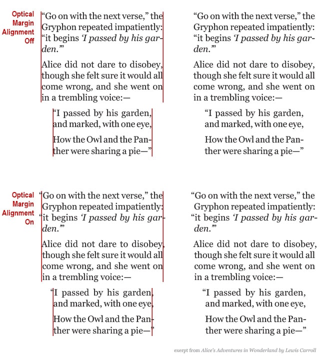
This optical margin is the "invisible line" that your eyes see when looking at the right and left edges of a block of text. Take a look at the text samples below:
optical-margin-alignment
When characters like quotation marks, periods, commas, hyphens and dashes, and others are not hung into the margins, it creates a visual indent, or negative space, in the block of text as a whole that can sometimes feel distracting to the reader. Using optical margin alignment helps create the appearance of a flush right and left edge by removing the negative space. This more visually balanced text allows the reader a neat, clean, uninterrupted reading experience.
It should also be noted that, while this technique is widely used - especially with justified text, it's not a rule set in stone that it should always be used. It can be used throughout your book, or just in certain places, like excerpts, quotes or lists that, by design, are separated from the main flow of text. Ultimately the decision to use optical margins is a matter of preference that, as a self-publishing author, you can decide if it seems right for your book. Some people prefer the look of their text without the optical margin alignment and that's okay. The overall goal is to create a great reading experience and sometimes we get there in in different ways.

Help for Independent Presses

Book Design & Production

Have you written a nonfiction or fiction manuscript? After it has been professionally edited, I can design the interior pages and cover, plus guide you through the maze of book publishing and printing. To get started, contact me to discuss your project and my helpful guide for authors.

Open post

What goes on your Title Page?

Did you know that your book can contain two title pages? The first appears as the very first page when you open the cover and is called a half title page. The only thing on this page is the title of your book, usually small and understated. A half title page is not a requirement, and is mostly a leftover tradition from back-in-the-day when it is said to have been used as protective measure during the printing process.
Whether or not you choose to include a half title page is up to you and the needs of your books, but you wouldn't want to leave out the second type, the title page. The title page is an important page that acts as a welcoming committee to those who've opened the book. It is the official start of your book and its design and content is quite simple, containing the:
  • full title of the book
  • subtitle if there is one
  • author name(s)
  • publisher name and location
Depending on the genre of your book other information may also appear here, such as an editor name or edition numbers.
Just because a title page is simple doesn't mean it has to be boring (says the designer!) A common design technique is to echo the cover by adapting artwork and/or font styles used there to appear on this page. If complex artwork is used on the cover, you may have to simplify it so that it doesn't overwhelm the page and that it prints well in black and white (if that's how your book's interior will be printed.)
Here are a couple examples of title pages that I've recently designed.

The title page for The Change Code uses the same font from the cover and a nautilus shell used as a decorative element both on the cover and throughout the interior as a section divider.

Seizing Moments of Possibility closely echoes the cover design. It also lists the publishing company name and location under the author name.

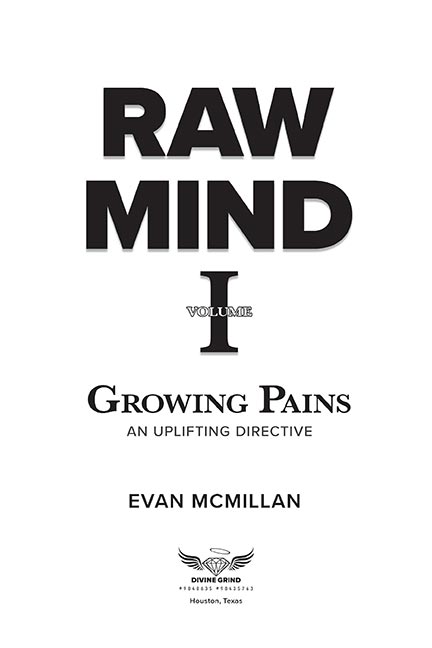
Raw Mind also closely echoes the cover design and shows the publishing company name, logo, and location.

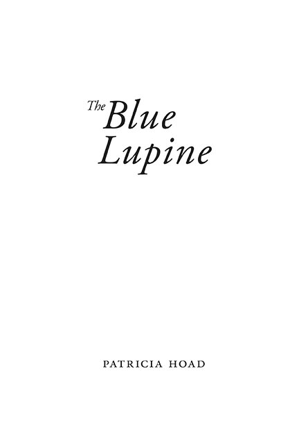
The Blue Lupine, a book of poetry, uses a very simple title page design. The font and arrangement of text echoes the cover.

Help for Independent Presses

Book Design & Production

Have you written a nonfiction or fiction manuscript? After it has been professionally edited, I can design the interior pages and cover, plus guide you through the maze of book publishing and printing. To get started, contact me to discuss your project and my helpful guide for authors.

Open post

What goes in the front matter of your book

Do you wonder what kind of content should go in your front matter? Front matter is all of the pages before your first chapter or part and contains information about your book, provides a way to navigate the book, and introduces it to your reader. These pages are numbered with lowercase roman numerals (i, ii, iii, iv, v, etc.) and, although they shouldn't be printed on the title page through the table of contents, they are included in your total page count. Page 1 usually starts at the first chapter or part.

Tips for organizing your front matter.

The Chicago Manual of Style indicates that the order of the front matter should be:

  • Book half title
  • Series title, other works, frontispiece, or blank
  • Title page
  • Copyright page
  • Dedication
  • Epigraph
  • Table of Contents
  • List of Illustrations
  • List of Tables
  • Foreword
  • Preface
  • Acknowledgments (if not part of preface or in the back matter)
  • Introduction (if not part of text)
  • Abbreviations (if not in the back matter)
  • Chronology (if not in the back matter)

Clearly, not all of these elements will be in every book, but this will give you guidance on how to organize the parts that you do have.

Pro-Tip: To help your book designer organize and set a design for your book, create a content map for them. This can be a simple Word document that lists each component of your book. Any special instructions that you have for each part can be included.

Help for Independent Presses

Book Design & Production

Have you written a nonfiction or fiction manuscript? After it has been professionally edited, I can design the interior pages and cover, plus guide you through the maze of book publishing and printing. To get started, contact me to discuss your project and my helpful guide for authors.

Open post
Tips on how to prepare your manuscript for the book designer.

Preparing Your Manuscript for the Book Designer

So you've finished writing your book and are ready for the layout and design stage. Before you send it off to your formatter there's a bit of "house cleaning" to do first to ensure that they can clearly see and understand the formatting needs of your book. Remember, the designer is not as familiar with your content as you are, so preparing a clean document to send to them saves time (and cost) and helps eliminate guess work or misunderstanding of how an item is intended to look on the page.
So! roll up your sleeves and get ready to clean up your working document.

Tips for preparing your manuscript
for the book designer.

  • Send the final and complete manuscript in Microsoft Word. Including all the front matter, the book block and any back matter. If your chapter has titles, include a table of contents, but don’t add the page numbers. This is one of the last things your designer will do after all of the text is set.
  • Organization and consistency is key. Manuscripts that are complex, especially non-fiction can become messy very quickly and, if not organized properly, can make it difficult for your designer to know how to proceed. So make sure that each element, such as chapter titles, section titles, each level of subheads and bullets, quotes, or other similar content is formatted the same throughout.
  • Make sure the information hierarchy is clear. For example, with part titles and numbers, chapters titles and numbers, sub-heads, and sub-sections it is important to make sure each of these elements is formatted the same way throughout the manuscript - and each are different from one another. The idea is to make it so the designer can easily spot the distinct parts and format them accurately.
    • For example: Format all part titles bold and 24 points, then make all chapter titles bold and 20 pt, so when the designer looks at your Word manuscript, they can easily see that those two items are not the same thing.
    • The same would be true for subheads. To indicate which is which, maybe format level one subhead as bold and 14 points, and then perhaps make level two subheads italic and 12 points.
  • If you’ve used unusual characters, foreign letters or words or other symbols, point these out to the designer.

Format the manuscript simply

  • Use only one font throughout the manuscript. Times New Roman is just fine. It can be used for everything - the chapter titles, subheads, everything. If a complimentary font is desired, this will be communicated before the project starts and the designer will apply it appropriately in their professional layout software.
  • Use of bold and italic is perfectly okay. The designer can easily see and retain that formatting.
  • Tables should be formatted simply with no extra spaces or tabs in the cells
  • If there is a pull quote or a boxed text feature, indicate this in your manuscript by typing [boxed text starts here] before the text that should be boxed, and [boxed text ends here] after that text.

Things to avoid:

  • Tabs or multiple spaces to indicate indents.
  • Double spaces after periods.
  • Hard returns. These are not "real" paragraphs and usually happen on accident when you press shift + enter to force text to drop to the next line. If these exist in your document its hard to tell if you meant to start a new paragraph or you simply wanted a specific word to be on the next line.
  • Make sure to hit the enter key once after a paragraph.
  • Multiple fonts. Please only use one font for your entire manuscript. Your designer and you will discuss fonts before your project begins.
  • Text boxes or Word art. These are available as formatting tools in Microsoft Word, but will not translate well upon import to professional layout software. If you need something special such as boxed text or other special formatting use the method described above to show your designer where it should be placed and speak with them to communicate your intention.
  • Microsoft Word is not a great layout tool. As much as you may want to, please don’t try to predesign the pages in book form. This is your designer's job and all your hard work will only have to be stripped out of the manuscript before it can be worked with in professional layout software.

Images:

  • Do not place images into your Word Document. Instead include the image name and its caption in your manuscript in the area where the image should appear.
    • For example: [imagename.jpeg, caption text]
  • Send the high resolution files (minimum 300dpi) in a zip file to your designer separately.
  • Name your images with the chapter number and something short that describes what is in the image.
  • Make sure you have permission to use any photo that you send. Do not send images that you find in a Google search. These will likely not be high enough resolution and you probably won’t have the necessary permissions to use them in your book.
  • If you need stock photos ask your designer for a trustworthy site to find the image you need. The price can range all the way from free to much more expensive, but generally you can find what you need for only a few dollars.
Pro-Tip: If your book has several images, provide a separate document to your book designer that has a list of every chapter and the images that should appear within each of those chapters. For each image, list the name and order of appearance.

Help for Independent Presses

Book Design & Production

Have you written a nonfiction or fiction manuscript? After it has been professionally edited, I can design the interior pages and cover, plus guide you through the maze of book publishing and printing. To get started, contact me to discuss your project and my helpful guide for authors.

Open post
Poetry Book Design

Designing Poetry Books

As a designer I enjoy when I get to work on projects that allow me to stretch and flex my creative muscles. One such type of project is poetry book design! Poetry has experienced an upsurge in popularity during this time of pandemic and I've had the opportunity to work on a few poetry books recently. So, I thought I'd discuss the unique creative challenges that come with creating a book of poetry.
Poetry, being a work of art in itself, inherently contains much of the design in the way the author has written it. A very expressive form of writing, every carefully chosen word and specifically spaced or indented line helps to evoke feeling and meaning. Because each poem is an artistic entity unto itself the range of style and formatting can be quite vast.
With careful attention to each line, formatting poetry requires especially flexible design attention to ensure that the author's intended structure is, as much as possible, retained on the page. Poetry styles can vary significantly from poem to poem. Some styles are straight verse, some have short lines, some have staggered lines, some poems are very long and some only have one line. This can be a lot juggle when attempting to create a uniform book.
To ensure a beautiful book of poetry that is reflective of your work, a few considerations that we will discuss in our introductory meeting and that I will take into account as I design the pages are:
  • Trim Size
  • White Space
  • Position of page numbers and running heads/feet
  • Order of poems
  • Text and Page alignment
  • Hanging indentations for long lines that wrap to the next line
  • Page breaks for poems that require multiple pages
  • Facing pages for poems that require two pages
Poetry is a fun and particularly interesting challenge to plan and format with a goal that strives for balance on each page to achieve the overall best appearance for the work as a whole.

Help for Independent Presses

Book Design & Production

Have you written a nonfiction or fiction manuscript? After it has been professionally edited, I can design the interior pages and cover, plus guide you through the maze of book publishing and printing. To get started, contact me to discuss your project and my helpful guide for authors.
Open post

A Look at Imprints

Should you set up an imprint or multiple imprints for your self publishing company?

As a self publishing author, your books are published under your publishing company name. This is also called your publishing imprint and is what is recorded in book industry databases used by retailers, book wholesalers, and book distributors, it's on your copyright page and is assigned to your ISBN numbers.
You can also have multiple imprints that fall under your publishing company. For example, maybe you normally write and publish nonfiction under your publishing imprint (let's call it "Mountain Life Books"), but then you find that you want to write and publish cookbooks or some other type of book with subject matter that doesn't quite fit under your main imprint. You can choose a new imprint name (let's call it Tasty Eats Press) that better reflects the new books' subject matter. Then, on your copyright page and in other places, it would say "Published by Tasty Eats Press, an imprint of Mountain Life Books."
It is fun to think about different imprint names - you can get creative with it! An imprint represents your business and you as an author. You'll want to carefully research the name that you choose and then register it as either a Fictitious Business Name (FBN) or Doing Business As (DBA) with your state. Check with your local state regulations for specific details.

Want more tips like this? Subscribe to my monthly book design newsletter.

Help for Independent Presses

Book Design & Production

Have you written a nonfiction or fiction manuscript? After it has been professionally edited, I can design the interior pages and cover, plus guide you through the maze of book publishing and printing. To get started, contact me to discuss your project and my helpful guide for authors.
Open post

The Chapter Opening Page in Book Design

Elements and design choices to consider when designing a chapter opening page.

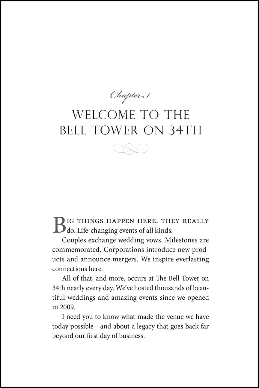
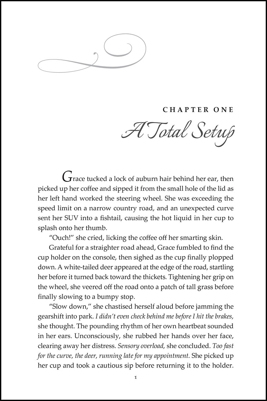
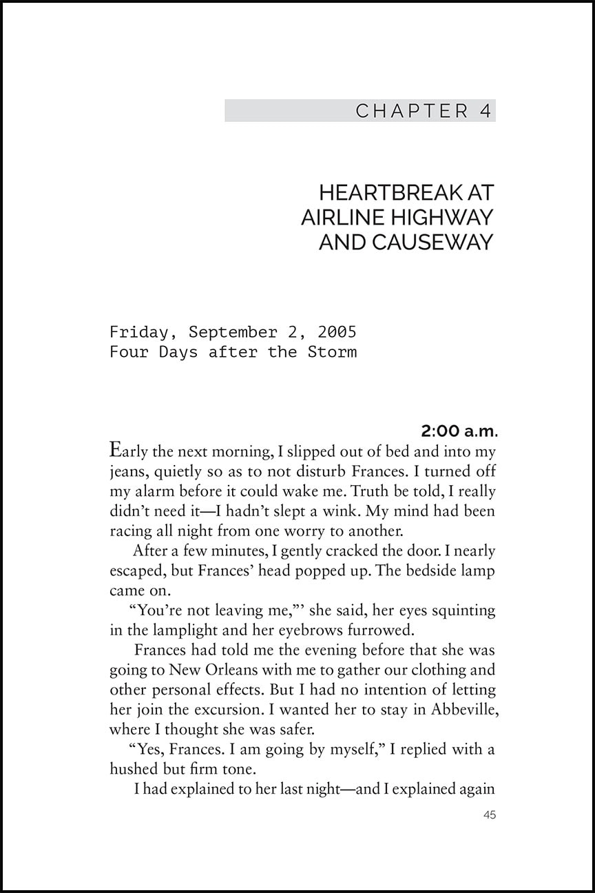
The first page of each chapter is one of my favorite things to design. This is one place where the tone of your book and its subject matter can be visually communicated. The design of these pages can range from very simple to more elaborate design choices that spread across two pages.
The Chicago Manual of Style says that each chapter normally starts on a new page, and can sit on a verso (left) or recto (right) page, although the first chapter almost always starts on a recto.
Some elements that you can expect to see on a chapter opening page are:

  • Chapter Number (the word chapter is often omitted)
  • Chapter Title
  • Subtitle (if there is one)
  • Epigraph (if there is one)
  • Drop folios (or no folio)
  • No running heads
  • The design of this page can vary greatly and should reflect your book's subject matter and tone. The right choice for you may be incredibly simple and understated with only the chapter title or number, or it could be more lively and contain graphics and other relevant display items.
    Some possible elements for the chapter opening page design include:

  • Ornamentation or graphics
  • Illustration
  • A font complimentary to the body text and expressive of the feeling of the content
  • A font that echoes the font choice on the cover
  • A drop cap in the first paragraph of text
  • Italics or small caps on the first line of the first paragraph
  • Whichever design style that you choose for your chapter opening page, it is important that it does not distract the reader from their reading flow. Beautifully designed chapter opening pages can be enjoyable to the reader and a refreshing pause before diving into the next section of text.
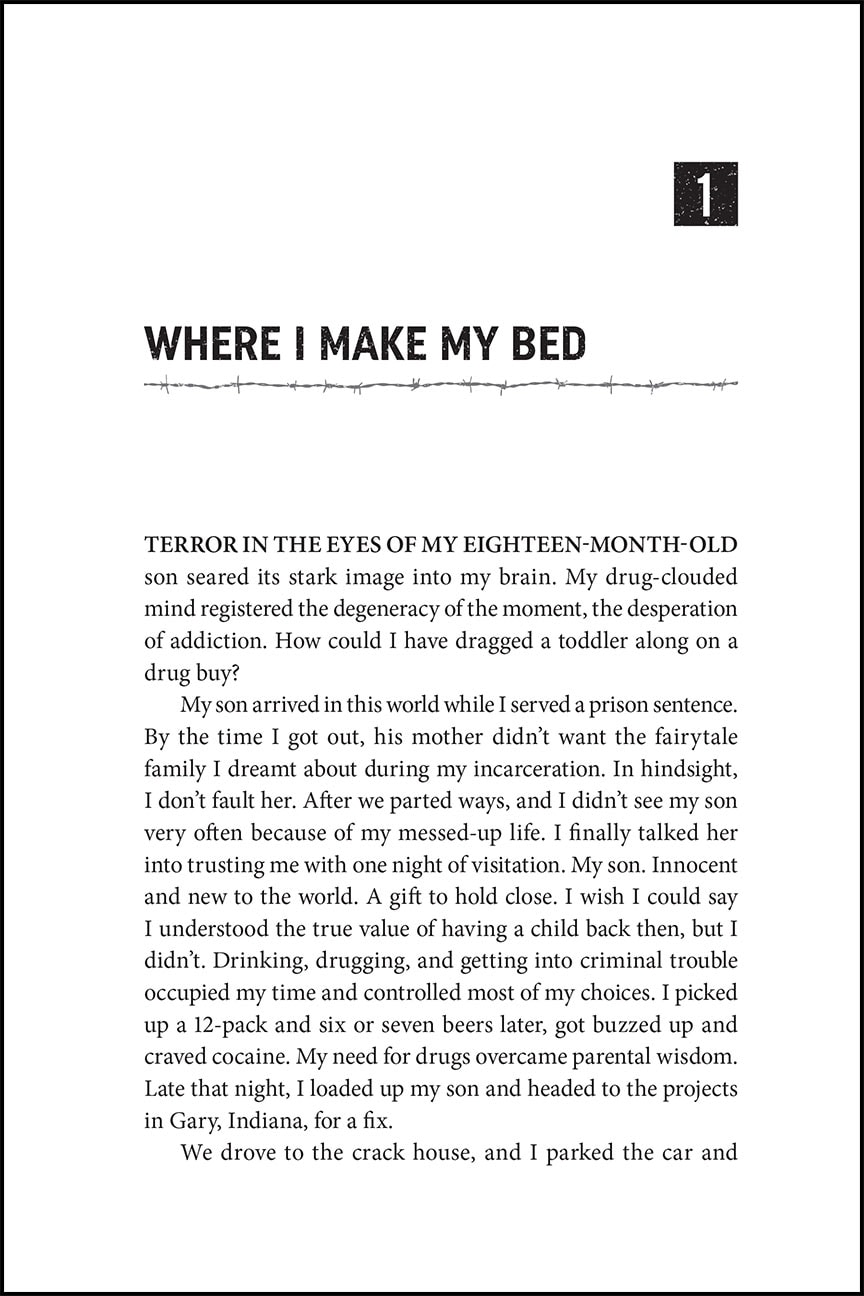
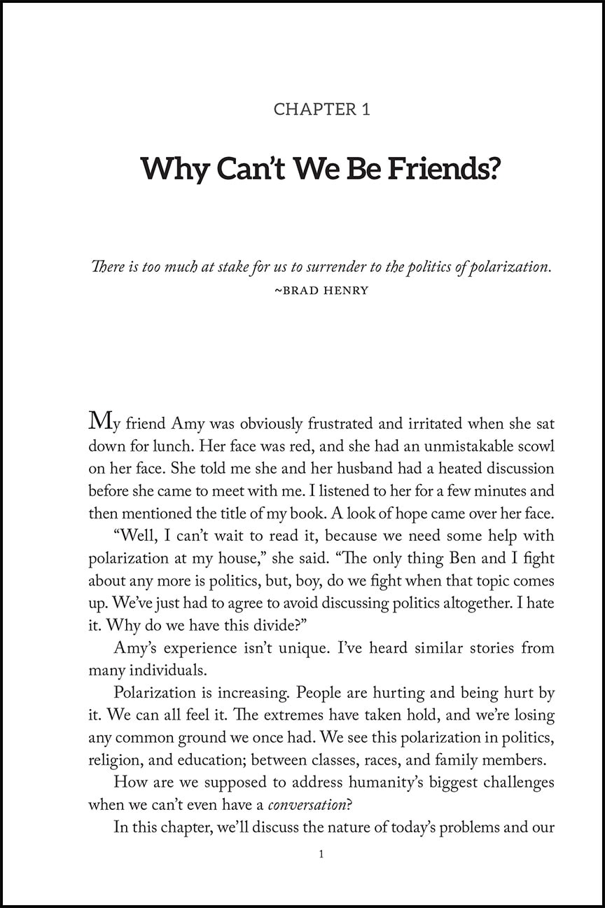
    Below are a few examples of chapter opening pages that I've recently designed.

    Train Traffic chapter opening page design
    Life is a Fifteen Round Fight chapter opening page design
    When I work with you to design and format your book interior we will spend some time together before the project begins so that I can learn about your book and any style preferences or ideas that you have. Using this information I then go to work making that vision come to life. Depending on the project I will present a couple different options for the interior design that you can choose from so that you can see the possibilities and refine it to reflect what is best for your book.
    Please email to set up a consultation to design your self published book!

    Want more tips like this? Subscribe to my monthly book design newsletter.

    Help for Independent Presses

    Book Design & Production

    Have you written a nonfiction or fiction manuscript? After it has been professionally edited, I can design the interior pages and cover, plus guide you through the maze of book publishing and printing. To get started, contact me to discuss your project and my helpful guide for authors.

    Open post

    Paragraph Separators in Book Page Design

    For when you need a pause or a shift in your narrative.

    When you need to indicate a pause, a passage of time, or a scene change within a chapter of your book use a paragraph separator. This is a visual cue to your reader that something has changed. A paragraph separator can be as simple as an extra line space between two paragraphs, a series of three or four asterisks (*) separated by an em or en space, or they can be a little more graphic with the use of an ornament.

    Margaret Turner Taylor's latest book, Traveling Through the Valley of the Shadow of Death, is a historical fiction spy thriller set in WWII Germany. When choosing an ornament to use for paragraph separation in this book I chose the ornament below that also seems representative of the style of the subject matter.

    Ornaments are like little Easter eggs hidden within many common fonts. To find them you'll need to view the full set of characters, known as glyphs, contained within the font. If you have a layout program such as Adobe InDesign the ornaments can be found in the glyphs panel. In Microsoft Word they can be found in the Insert > Symbol menu.

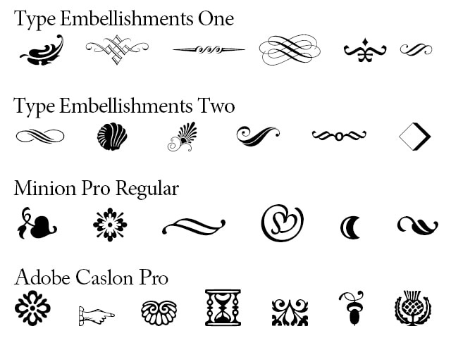
    For the ornament used in Margaret's book I used a font that I purchased called Type Embellishments Two. This set, as well as Type Embellishments One, is made up only of ornaments. I love scrolling through them to choose just the right look for the book that I'm working on. Below is a sampling of some of the ornaments found in this typeface as well as some that you will find hidden in common fonts that may already live on your computer.
    Ornament glyphs in font sets
    Samples of ornament glyphs in different font sets.

    Want more tips like this? Subscribe to my monthly book design newsletter.

    Help for Independent Presses

    Book Design & Production

    Have you written a nonfiction or fiction manuscript? After it has been professionally edited, I can design the interior pages and cover, plus guide you through the maze of book publishing and printing. To get started, contact me to discuss your project and my helpful guide for authors.
    Open post

    The Change Code Book

    Custom Book Design for

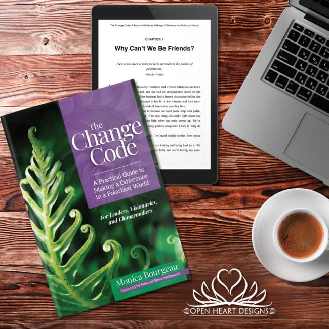
    The Change Code: A Practical Guide to Making a Difference in a Polarized World

    written by Monica Bourgeau
    published by New Phase Publishing

    This book has it all! A custom designed cover, call outs, pull quotes, tables, charts, custom designed graphics, an appendix and bibliography. It was so fun and challenging to design this book.

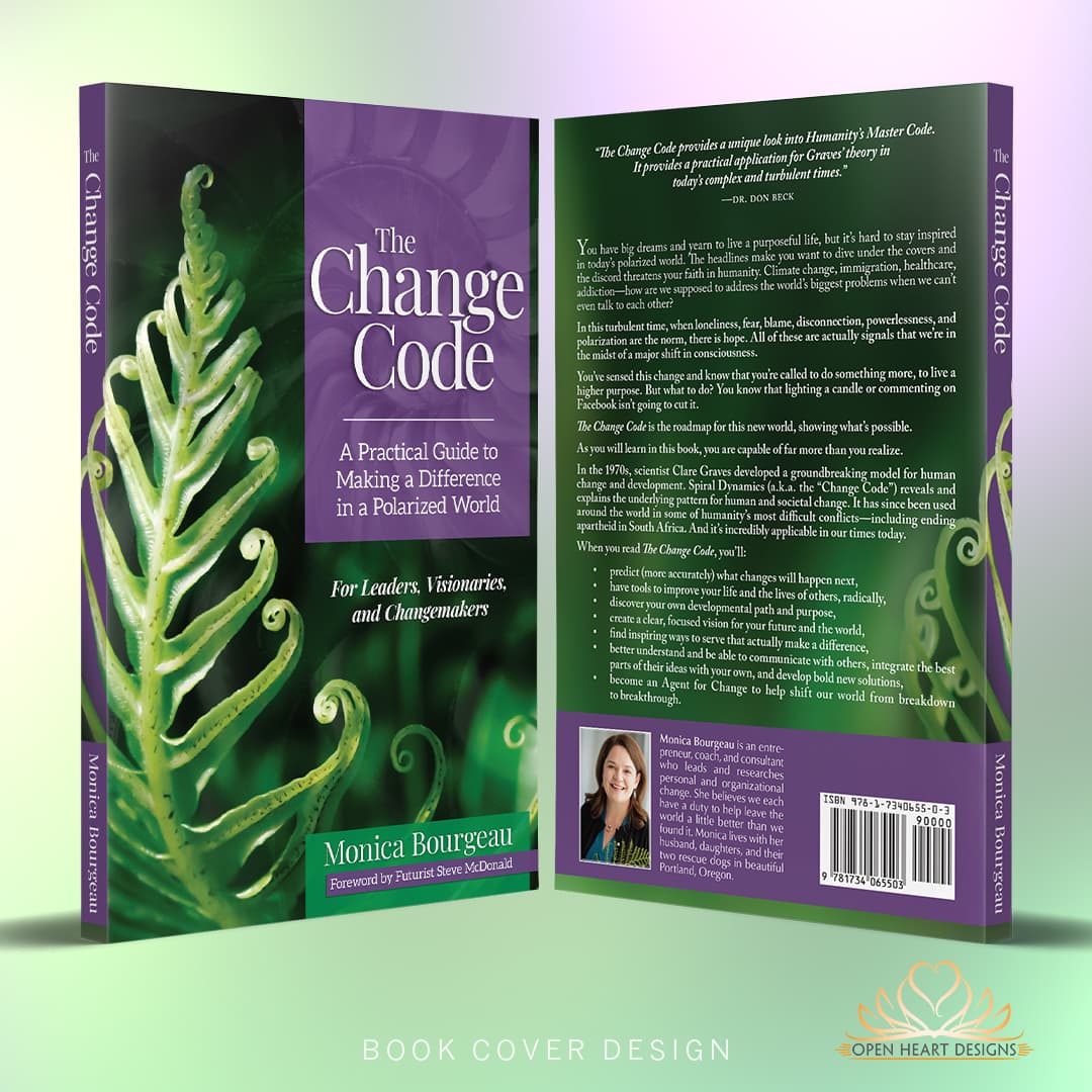
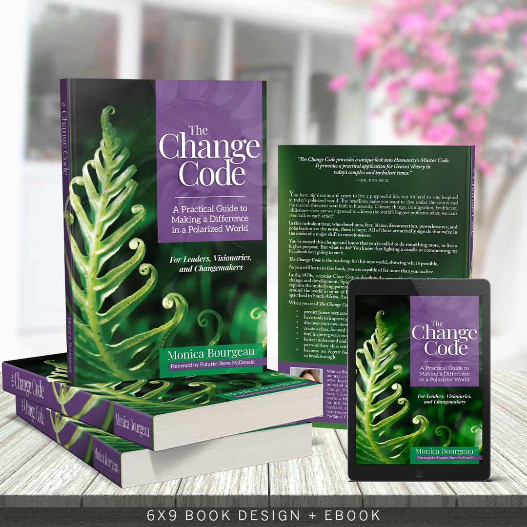
    Cover Design

    After our initial consultation meeting, learning about the content and purpose of the book, the author sent me her design vision for the cover. The book is about Spiral Dynamics and and she wanted a very natural, beautiful look that incorporated a spiral. I spent some time researching other book covers to get an idea of what already existed in this genre and to help me create a design that fit within that genre, but also stood on its own. Then, after a lengthy search for just the right images, I sourced a couple that were beautiful and helped me to design the cover that you see.

    I use a combination of Adobe Photoshop and Adobe InDesign to complete a cover design.

    book cover design

    Interior Design

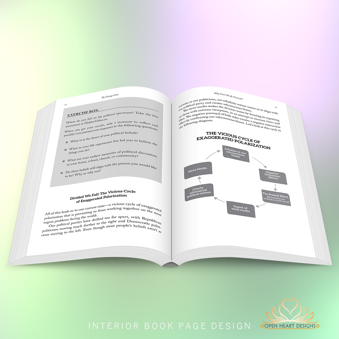
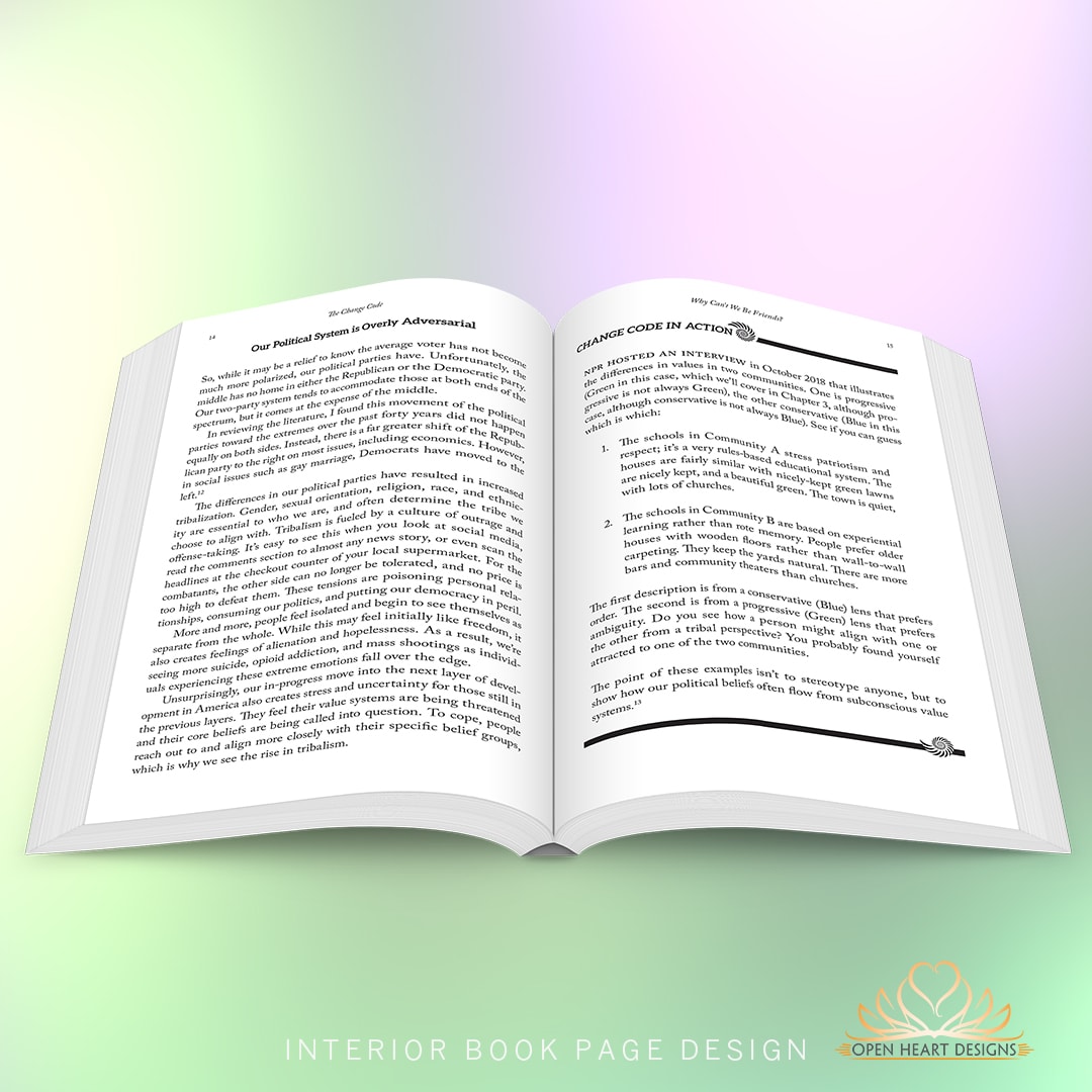
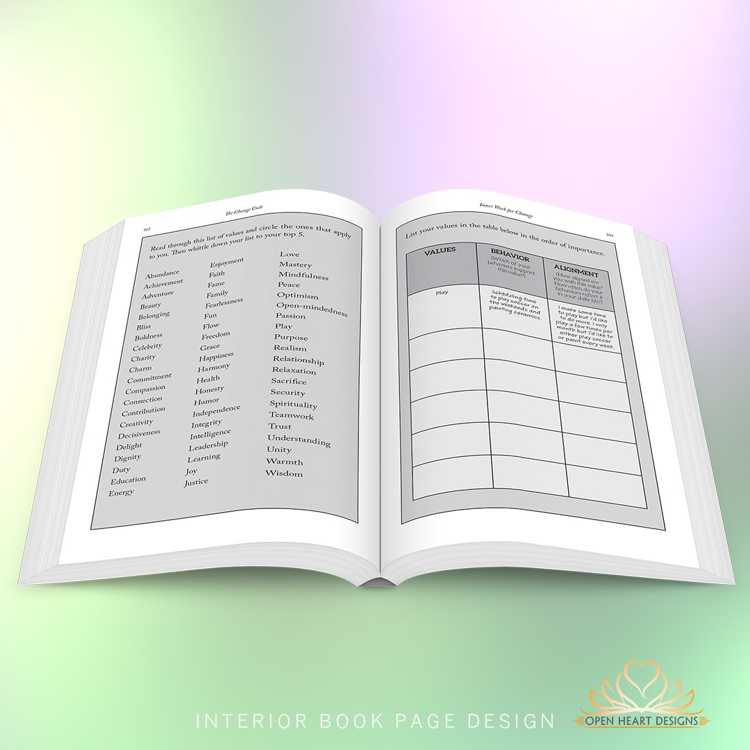
    This book has many complex design components that help Monica tell and exhibit her story in a way that makes it easy for readers to learn and enjoy. Some of these design elements include:

    • Quotes
    • Pullouts
    • Sidebars
    • Custom Illustrations
    • Exercises
    • Endnotes
    • Appendix
    • Bibliography

    Except for the custom illustration, I do my design work on book interiors in Adobe InDesign.

     Custom Book Design
    Interior Book Design and Layout
    Interior Book Design and Layout

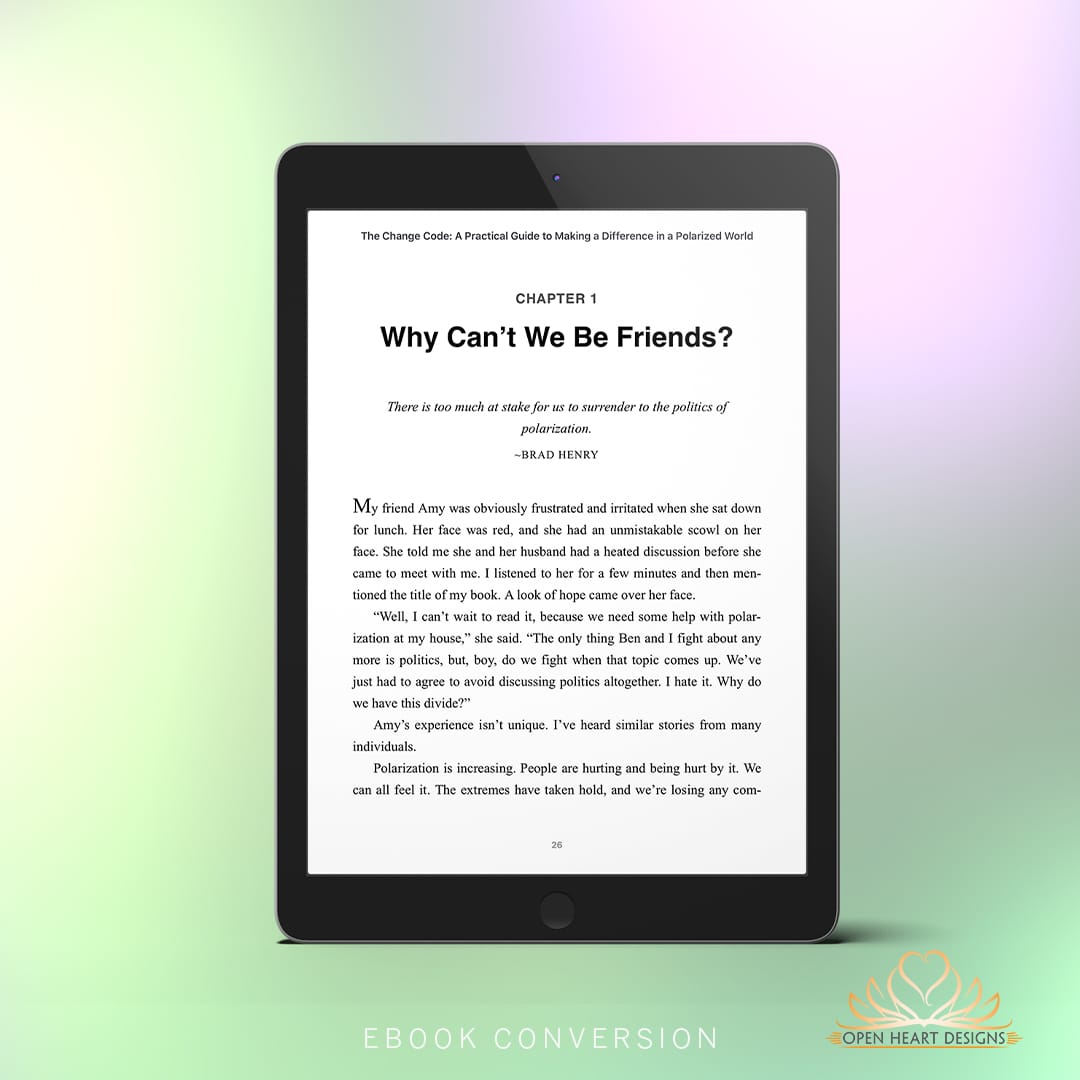
    eBook Conversion

    This book is also available as an ebook.


    Interior Book Design and Layout

    Print on Demand

    The printers of choice are Ingram Spark and Amazon and are available to order on all the major online outlets.

    Visit The Change Code website to order your copy!


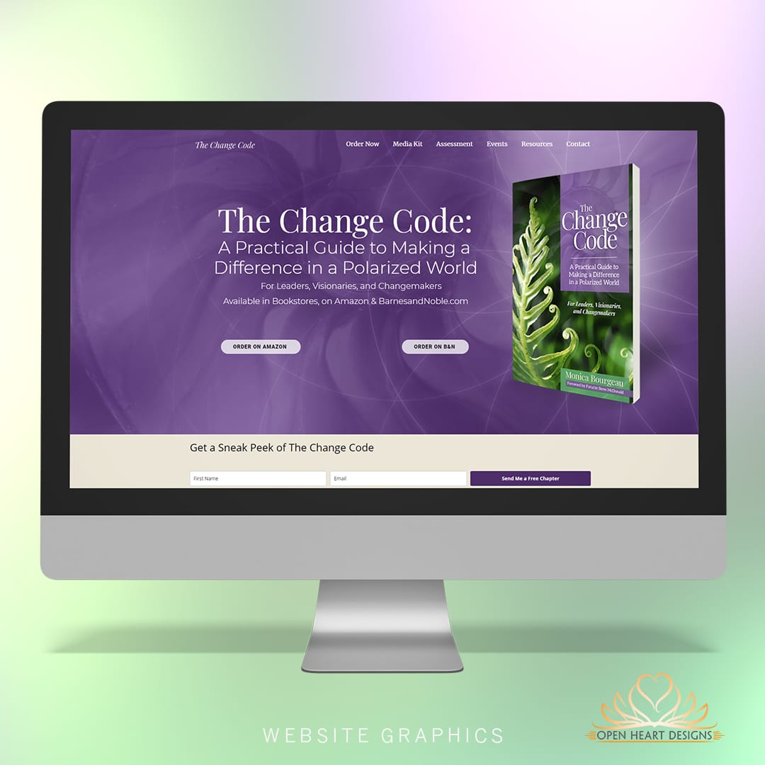
    Website Graphics

    This project included custom web graphics designed to compliment the design of the book.


    Cover and Interior Book Design and Layout

    Help for Independent Presses

    Book Design & Production

    Have you written a nonfiction or fiction manuscript? After it has been professionally edited, I can design the interior pages and cover, plus guide you through the maze of book publishing and printing. To get started, contact me to discuss your project and my helpful guide for authors.
    Open post

    What is your resolution?

    With the holiday season upon us and the new year quickly approaching, many people spend time thinking about resolutions that they want to fold into their life.
    When I, your book designer, think about resolutions I am hopeful for only the best! That is to say - at least 300 dpi. What on earth could that mean? Why, image quality of course!

    Book Design Tip: Image Quality

    Proper resolution for printing success.

    To help ensure beautiful, crisp, printed results, a book containing photos - whether they will be printed in color or black and white, need to have a high resolution. The resolution of an image refers to the number of pixels within the image. More pixels means better detail and higher quality. To achieve this, it's best to start with the original photo.
    If you will be scanning physical prints, you can adjust your scanner settings to scan the image in to your computer at the proper resolution. The minimum for print is 300 dpi., however, especially if the photo has small physical dimensions, I prefer to receive scanned images at a minimum of 600 dpi.
    Digital images from phones or cameras may be successfully used in print as long as the photo was taken with the highest quality settings and it has large physical dimensions.
    Here is an example of what happens when a low resolution image goes to press, as opposed to the same image saved with a high resolution:

    This photo had a low resolution, and very small physical dimensions. It had to be stretched to fit the space. As is evident, there aren't enough pixels to keep the image detailed and sharp.

    This photo had a high resolution and large physical dimensions. The photo will reproduce crisp and clear.
    If you aren't sure your photo and image files are saved in high resolution, ask your designer if she can do an assessment to determine if the images will reproduce well in print. Your designer may also be able to offer suggestions to help you get your images saved in high resolution.
    Note: Saving a blurry photo in high resolution does not magically make it sharp and in focus. Sometimes editing a photo can improve it somewhat, but it's always best to have a photo that was taken in focus.

    Want more tips like this? Subscribe to my monthly book design newsletter.

    Help for Independent Presses

    Book Design & Production

    Have you written a nonfiction or fiction manuscript? After it has been professionally edited, I can design the interior pages and cover, plus guide you through the maze of book publishing and printing. To get started, contact me to discuss your project and my helpful guide for authors.
    Posts navigation

    1 2
    Scroll to top