fbpx
Open post

A Look at Imprints

Should you set up an imprint or multiple imprints for your self publishing company?

As a self publishing author, your books are published under your publishing company name. This is also called your publishing imprint and is what is recorded in book industry databases used by retailers, book wholesalers, and book distributors, it's on your copyright page and is assigned to your ISBN numbers.
You can also have multiple imprints that fall under your publishing company. For example, maybe you normally write and publish nonfiction under your publishing imprint (let's call it "Mountain Life Books"), but then you find that you want to write and publish cookbooks or some other type of book with subject matter that doesn't quite fit under your main imprint. You can choose a new imprint name (let's call it Tasty Eats Press) that better reflects the new books' subject matter. Then, on your copyright page and in other places, it would say "Published by Tasty Eats Press, an imprint of Mountain Life Books."
It is fun to think about different imprint names - you can get creative with it! An imprint represents your business and you as an author. You'll want to carefully research the name that you choose and then register it as either a Fictitious Business Name (FBN) or Doing Business As (DBA) with your state. Check with your local state regulations for specific details.

Want more tips like this? Subscribe to my monthly book design newsletter.

Help for Independent Presses

Book Design & Production

Have you written a nonfiction or fiction manuscript? After it has been professionally edited, I can design the interior pages and cover, plus guide you through the maze of book publishing and printing. To get started, contact me to discuss your project and my helpful guide for authors.

Open post

The Chapter Opening Page in Book Design

Elements and design choices to consider when designing a chapter opening page.

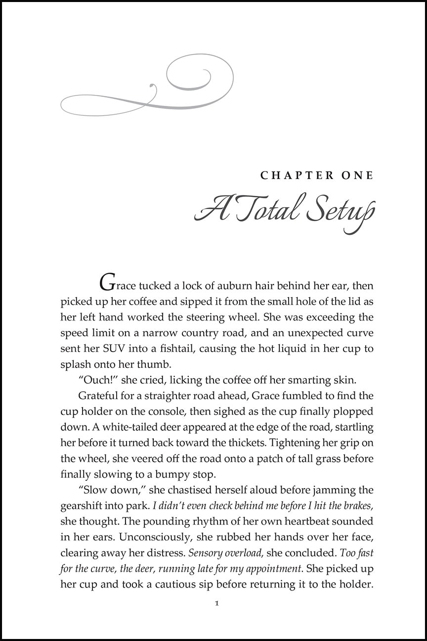
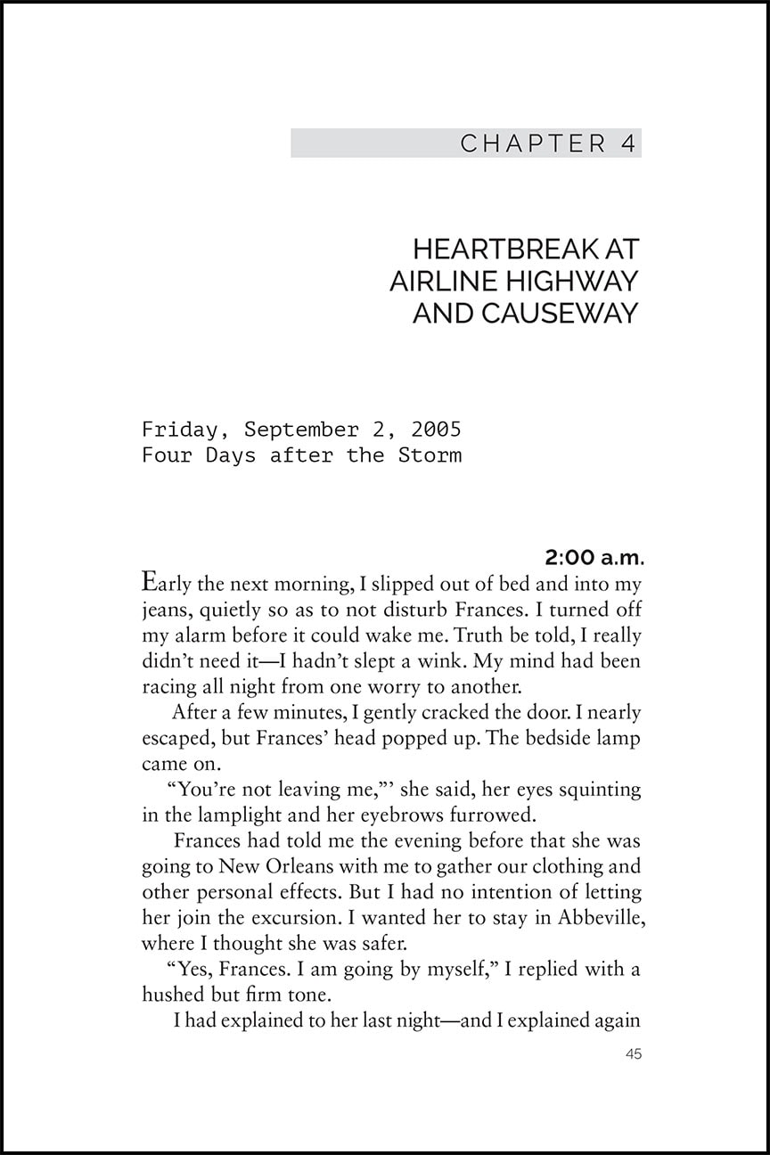
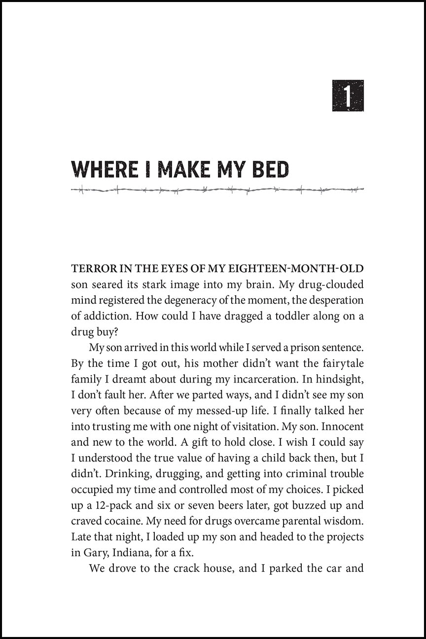
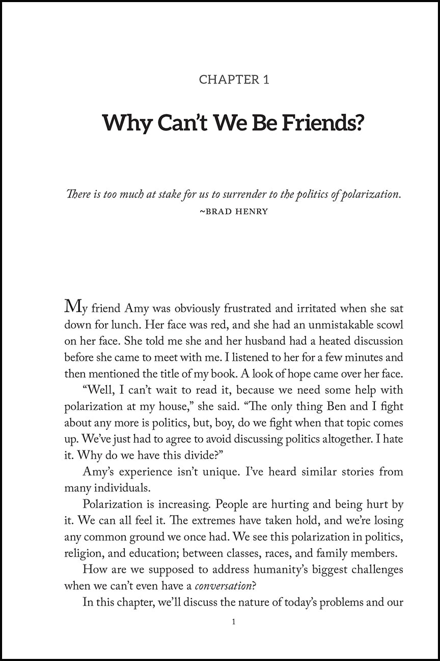
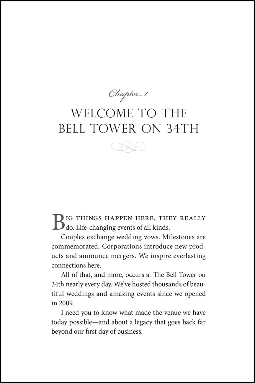
The first page of each chapter is one of my favorite things to design. This is one place where the tone of your book and its subject matter can be visually communicated. The design of these pages can range from very simple to more elaborate design choices that spread across two pages.
The Chicago Manual of Style says that each chapter normally starts on a new page, and can sit on a verso (left) or recto (right) page, although the first chapter almost always starts on a recto.
Some elements that you can expect to see on a chapter opening page are:

  • Chapter Number (the word chapter is often omitted)
  • Chapter Title
  • Subtitle (if there is one)
  • Epigraph (if there is one)
  • Drop folios (or no folio)
  • No running heads
  • The design of this page can vary greatly and should reflect your book's subject matter and tone. The right choice for you may be incredibly simple and understated with only the chapter title or number, or it could be more lively and contain graphics and other relevant display items.
    Some possible elements for the chapter opening page design include:

  • Ornamentation or graphics
  • Illustration
  • A font complimentary to the body text and expressive of the feeling of the content
  • A font that echoes the font choice on the cover
  • A drop cap in the first paragraph of text
  • Italics or small caps on the first line of the first paragraph
  • Whichever design style that you choose for your chapter opening page, it is important that it does not distract the reader from their reading flow. Beautifully designed chapter opening pages can be enjoyable to the reader and a refreshing pause before diving into the next section of text.
    Below are a few examples of chapter opening pages that I've recently designed.

    Train Traffic chapter opening page design
    Life is a Fifteen Round Fight chapter opening page design
    When I work with you to design and format your book interior we will spend some time together before the project begins so that I can learn about your book and any style preferences or ideas that you have. Using this information I then go to work making that vision come to life. Depending on the project I will present a couple different options for the interior design that you can choose from so that you can see the possibilities and refine it to reflect what is best for your book.
    Please email to set up a consultation to design your self published book!

    Want more tips like this? Subscribe to my monthly book design newsletter.

    Help for Independent Presses

    Book Design & Production

    Have you written a nonfiction or fiction manuscript? After it has been professionally edited, I can design the interior pages and cover, plus guide you through the maze of book publishing and printing. To get started, contact me to discuss your project and my helpful guide for authors.
    Open post

    Paragraph Separators in Book Page Design

    For when you need a pause or a shift in your narrative.

    When you need to indicate a pause, a passage of time, or a scene change within a chapter of your book use a paragraph separator. This is a visual cue to your reader that something has changed. A paragraph separator can be as simple as an extra line space between two paragraphs, a series of three or four asterisks (*) separated by an em or en space, or they can be a little more graphic with the use of an ornament.

    Margaret Turner Taylor's latest book, Traveling Through the Valley of the Shadow of Death, is a historical fiction spy thriller set in WWII Germany. When choosing an ornament to use for paragraph separation in this book I chose the ornament below that also seems representative of the style of the subject matter.

    Ornaments are like little Easter eggs hidden within many common fonts. To find them you'll need to view the full set of characters, known as glyphs, contained within the font. If you have a layout program such as Adobe InDesign the ornaments can be found in the glyphs panel. In Microsoft Word they can be found in the Insert > Symbol menu.

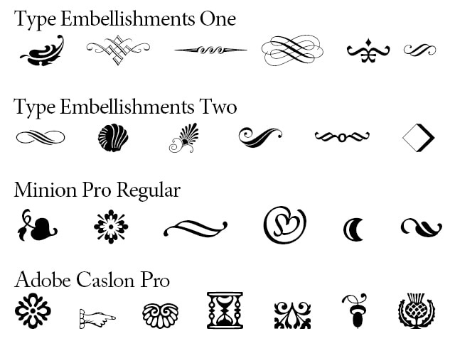
    For the ornament used in Margaret's book I used a font that I purchased called Type Embellishments Two. This set, as well as Type Embellishments One, is made up only of ornaments. I love scrolling through them to choose just the right look for the book that I'm working on. Below is a sampling of some of the ornaments found in this typeface as well as some that you will find hidden in common fonts that may already live on your computer.
    Ornament glyphs in font sets
    Samples of ornament glyphs in different font sets.

    Want more tips like this? Subscribe to my monthly book design newsletter.

    Help for Independent Presses

    Book Design & Production

    Have you written a nonfiction or fiction manuscript? After it has been professionally edited, I can design the interior pages and cover, plus guide you through the maze of book publishing and printing. To get started, contact me to discuss your project and my helpful guide for authors.
    Scroll to top